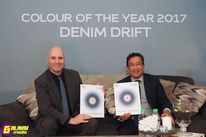
Kuala Lumpur, 16 November 2016 – AkzoNobel, the leading global paint and coatings company and manufacturer of Dulux today announces the launch of its annual trend forecast, ColourFuturesTM, depicting key colour trends for the year ahead and its prediction of the Colour of the Year at Wisma REHDA (Real Estate & Housing Developer’s Association Malaysia).
The leading paint brand’s team of global trend and design experts create the forecast after reflecting on emerging trends in people’s lives from interior-design and architecture to fashion, beauty to graphic design and social and economic influences.
TREND FORECASTING PROCESS:
International design and colour visionaries at AkzoNobel’s Global Aesthetic Center have been scouring the globe for the latest social and trend developments, to help them lead the way in colour innovation. The colour experts have used this insight to define the tones and styles that best represent how we will live our lives in 2017.
AkzoNobel announces overriding theme of ‘Life in a new light’, a new way of being’ for the new year
The brand’s overriding theme for the year ahead encourages you to celebrate a new look on the simple things that make life worth living. With real and authentic experiences becoming more important to us than ever before, we’re taking a fresh look at the everyday elements of life.
Mr Jeremy Rowe, Managing Director of AkzoNobel Decorative Paints South East & South Asia, Middle East said: “As the world changes, people are taking a fresh look at the everyday elements of life – our family and friends, work, connecting with nature, and the pleasure of experiences. It is befitting that ‘Life in a new Light’ is the driving influence for 2017 through which we encourage you to celebrate a new look on the simple things that make life worth living as seen in all our colour trends for the year.”
Mr Rowe further elaborated on the Colour of the Year 2017, “Blue is the colour of life, of every-day life. It is also a colour that is soothing and restful, Denim Drift seem to best describe the trend as the chosen shade “appears to drift from being definitely indigo blue to a lighter blue-grey named Smoke Grey in our colour catalogues.
COLOUR OF THE YEAR:
The blue we expect to see everywhere in 2017 is the Colour of the Year: ‘Denim Drift’ (90BG 30/073 also known as Smoke Grey). A beautiful, timeless and versatile grey-blue that takes on a different characteristic depending on how it’s used, perfectly capturing the mood of the moment and embodying our lives for 2017. Fitting into all life and interior styles, ‘Denim Drift’ is the perfect choice for reflecting AkzoNobel’s new perspective for 2017 and is the must-have colour for the year ahead.
Heleen van Gent from AkzoNobel’s Global Aesthetics Centre said: “Denim Drift is a wonderfully diverse foundation for the 2017 colour palette, which tells the story of our ‘life in a new light’ trend through its vast range of tones and colours. With blue set to dominate the interior trend agenda for 2017, Denim Drift does a fantastic job by representing the times we live in, designers love it and so do we.
“Denim drift and its complementary colour palette will set off your walls in a beautiful way. There is a colour combination for everyone’s taste and preference within the palette, with denim blue as our favourite.”
COLOUR AND DESIGN TRENDS OVERVIEW:
To complement the Colour of the Year, AkzoNobel has developed a family colour palette featuring a spectrum of blues and tones – creating a new way to combine colour. We see different proportions of darker and lighter blues that change the mood of a room or space. Denim Drift combined with a few of the lighter shades has a crisp and airy feel, whereas with a darker colour it’s more dramatic and moody. There is a huge variety of ways to apply this colour.
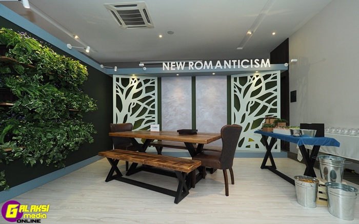
- New Romanticism: As the world becomes more passionate and vocal about issues surrounding the environment, this topic infiltrates the way we are living and our priorities in life, with sustainability and responsibility front of mind. We are all connected to nature and yet we live in an overwhelmingly urban and digital world. Being closer to the planet allows you to reconnect with your spiritual self, ensuring you have a healthy mind and soul. Although this trend comes from a place that is deeply considered, it translates into our homes in a boho, eclectic fashion that immerses you in the natural world and transforms your home with a truly creative flair.
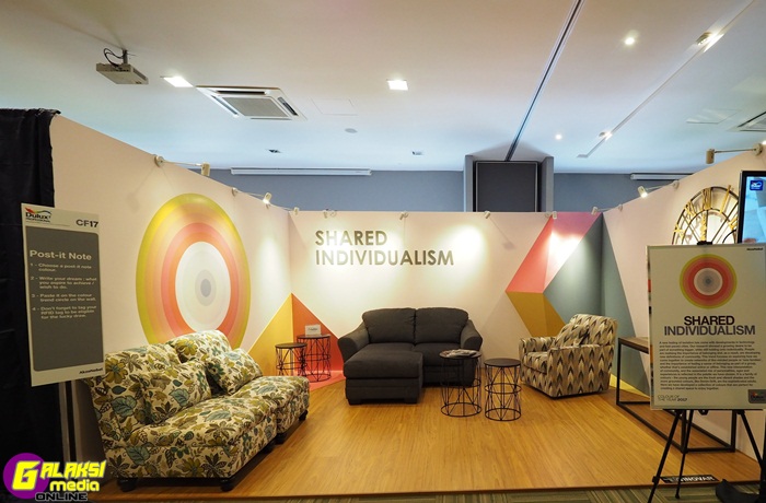
- Shared Individualism: Cities are growing, demographics and social settings are changing, and so the importance of having a sense of belonging and being part of a group is increasingly relevant. AkzoNobel has observed the way in which individuals come together to create a network or family, whether that’s friends, relatives or a wider community of like-minded people and share their ideas, dreams and spaces. This colour palette has a fresh and playful mood which is perfect for creating a shared space to enjoy together.
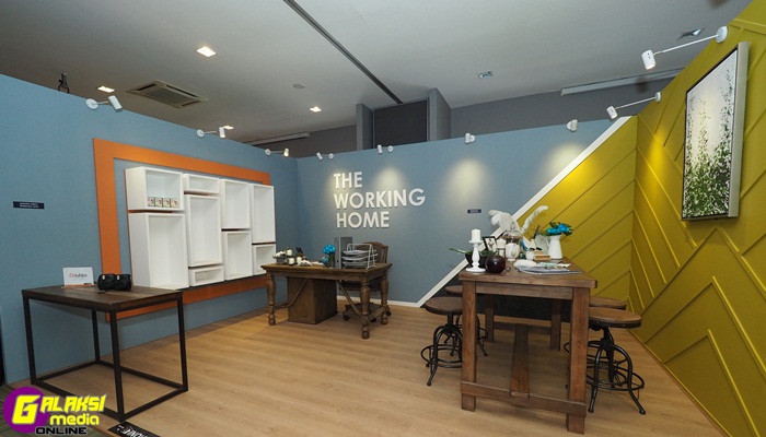
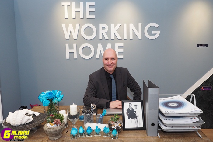
- The Working Home: The boundary between work life and personal life is shifting, and as such we seek a more balanced way of living and working. The home has become an office, and offices are becoming more like homes as we are living 24/7 lives, and so we need beautiful places to work at home, and new inspiration for how to do this. AkzoNobel has developed a colour palette to help you create different zones in the home, and a fluid environment that fits both. Whether you like to take your laptop to the kitchen with a coffee, or carve out a specific area for working, you can be comfortable, relaxed and focused within your living space.
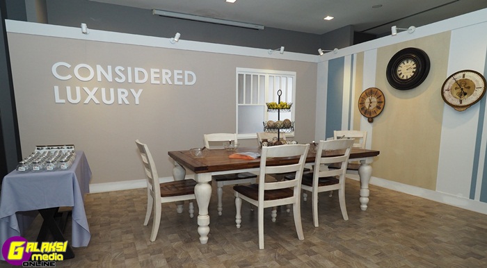
- Considered Luxury: This trend captures a new way of living; a new consumerism in which value is placed on experience rather than possessions. Creating memories that are priceless is our priority as we look at the world with fresh eyes, not adding clutter but experiences instead. It is the new way of consuming: buy less, choose well and make it last. You walk away with less but are infinitely more enriched. The senses are stimulated in a magical, powerful way with soft textiles, tactile walls, beautiful smells, and music. It is a subtle and modest luxury, with poetic surprise rather than cluttered belongings.
One of the highlights at the launch event saw members of the media being given an experiential tour of four dedicated rooms to complement the Colour of the Year. Each room designed to depict one of the four trends is created for guests to explore and to immerse themselves in the trends in an engaging and interactive manner with actual paint for photography and touch and feel allowing viewers to gaze to wander over and appreciate the rooms features.
For more information about ColourFuturesTM, please visit www.colourfutures.com.